Why the Middle Option Always Wins: The Decoy Effect Behind Origin Bento's 78% Sales Surge
The matsu-take-ume pattern is not coincidence. The decoy effect structurally rewires what feels like a rational choice.
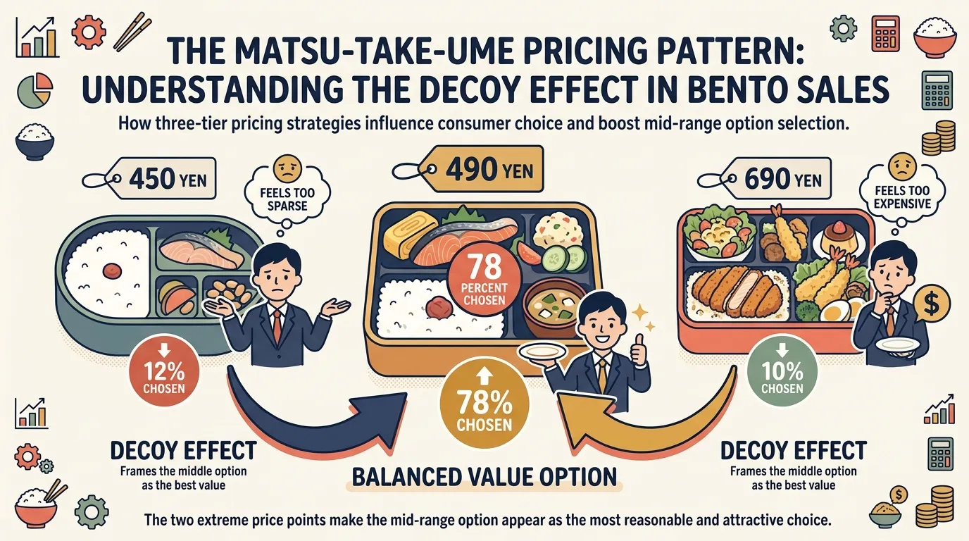
Japanese convenience bento chain Origin Bento introduced a three-tier pricing lineup — ¥450, ¥490, and ¥690 — and recorded a 78% sales increase in the middle-tier option. Nothing changed about the product. What changed was the structure of comparison.
The mechanism at work is the Decoy Effect: by deliberately placing disadvantaged options in a choice set, the target option is made to look like the obviously rational pick. Known in Japan as the “matsu-take-ume pattern” (pine-bamboo-plum, high-mid-low), this phenomenon is not luck — it is the product of intentional comparison architecture.
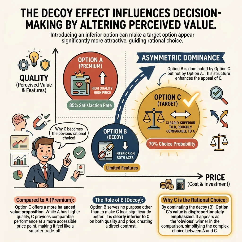
The Asymmetric Dominance Effect
The academic foundation is Huber, Payne, and Puto’s 1982 paper on the asymmetric dominance effect. When three options are presented and one (the decoy) is clearly inferior to another (the target) on all relevant dimensions, the target appears as the obviously superior, rational choice — not because it changed, but because the decoy provides a lopsided reference for comparison.
In Origin Bento’s case: the ¥690 option (matsu/pine) offers high volume and satisfaction but costs significantly more. The ¥450 option (ume/plum) is cheap but feels sparse. Seeing both extremes, the consumer experiences clear reasons to reject each: “¥690 is indulgent,” “¥450 feels insufficient.” The ¥490 middle option (take/bamboo) is the only choice without an obvious objection — and so it registers as the rational, balanced selection.
The decoy effect doesn’t reduce options. It reorganizes the evaluative frame around them. The consumer’s question shifts from “Which is the best value?” to “Which one makes the most sense?” — and the middle answer is pre-loaded to win that second question.
The critical structural requirement is that both extremes must feel genuinely plausible but subtly wrong. If either end is too obviously a decoy, consumers distrust the entire menu. Origin Bento’s construction works because ¥690 is legitimately good value for a larger meal — it just happens to anchor the ¥490 in the “reasonable” zone.
Price Lining as the Implementation Vehicle
Price Lining — deliberately structuring a catalog into distinct price tiers — is the practical delivery mechanism for the decoy effect. Once you establish three or more tiers, the selection geometry does the psychological work of routing customers toward the middle.
Japanese gift catalogs (ochugen/oseibo) are a textbook case. A lineup of ¥3,000, ¥5,000, and ¥10,000 gift sets consistently drives the majority of purchases to ¥5,000. The ¥3,000 option carries the social risk of “seems cheap,” while ¥10,000 risks “overdoing it.” The ¥5,000 option eliminates both anxieties simultaneously — not because it’s the best product, but because it’s the only one without a social cost.
This is the opposite logic from uniform pricing. ¥100 shops and uniform-price restaurants deliberately remove comparison by making every item identical in price. Price lining, by contrast, creates explicit price distance — and that visible distance gives consumers something to evaluate, leading them to converge on whichever option feels most “balanced.”
Contrast with No-Comparison Design
Where decoy pricing creates comparison, uniform pricing eliminates it. Hsee’s evaluability hypothesis explains why: when no comparative standard is provided, people skip value judgment and switch to a simpler question — “What do I want?” McDonald’s ¥390 Thank-You Set in 1987 (down from ¥520) applied bundling to collapse a three-item evaluation (burger + fries + drink) into a single unit price judgment. Bundling reduces comparison objects from many to one.
Each design is optimal in different contexts. Uniform pricing works when the product lineup is broad and the brand promise can carry intrinsic trust (“everything here is worth ¥100”). Price lining works when the category has meaningful quality differentiation and consumers benefit from having a clear “reasonable choice” surfaced for them.
Applying This to Your Own Catalog
The most common mistake in decoy design is making the manipulation visible. The decoy effect operates only when consumers feel they are making an independent, rational judgment. If the flanking options feel like transparent setups, the entire lineup loses credibility.
Sound tiered pricing requires each level to carry genuine, honest value. Origin Bento’s ¥690 box is actually a well-filled meal at ¥690. The ¥450 box genuinely serves the budget buyer. It is only because both extremes offer real value — not fake prices — that the ¥490 emerges as the natural convergence point. Decoy architecture is not about tricking customers. It is about building a comparison structure in which the right choice for most customers is also easy to identify.
Sources: 7 Psychological Pricing Strategies and Japanese Case Studies — free web Co., 2026
Related Articles
Be the Brand AI Cites: What Adobe Summit 2026 Revealed About GEO

If AI Can't Find You, Your Business Doesn't Start — Adobe CEO on the Agentic AI Gap
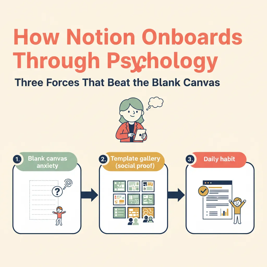
Why Notion's Onboarding Quietly Works

When Clicks Disappear: Five Marketing Trends Dominating 2026
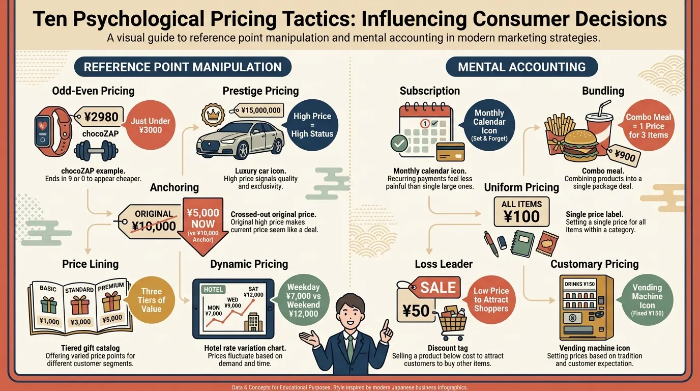
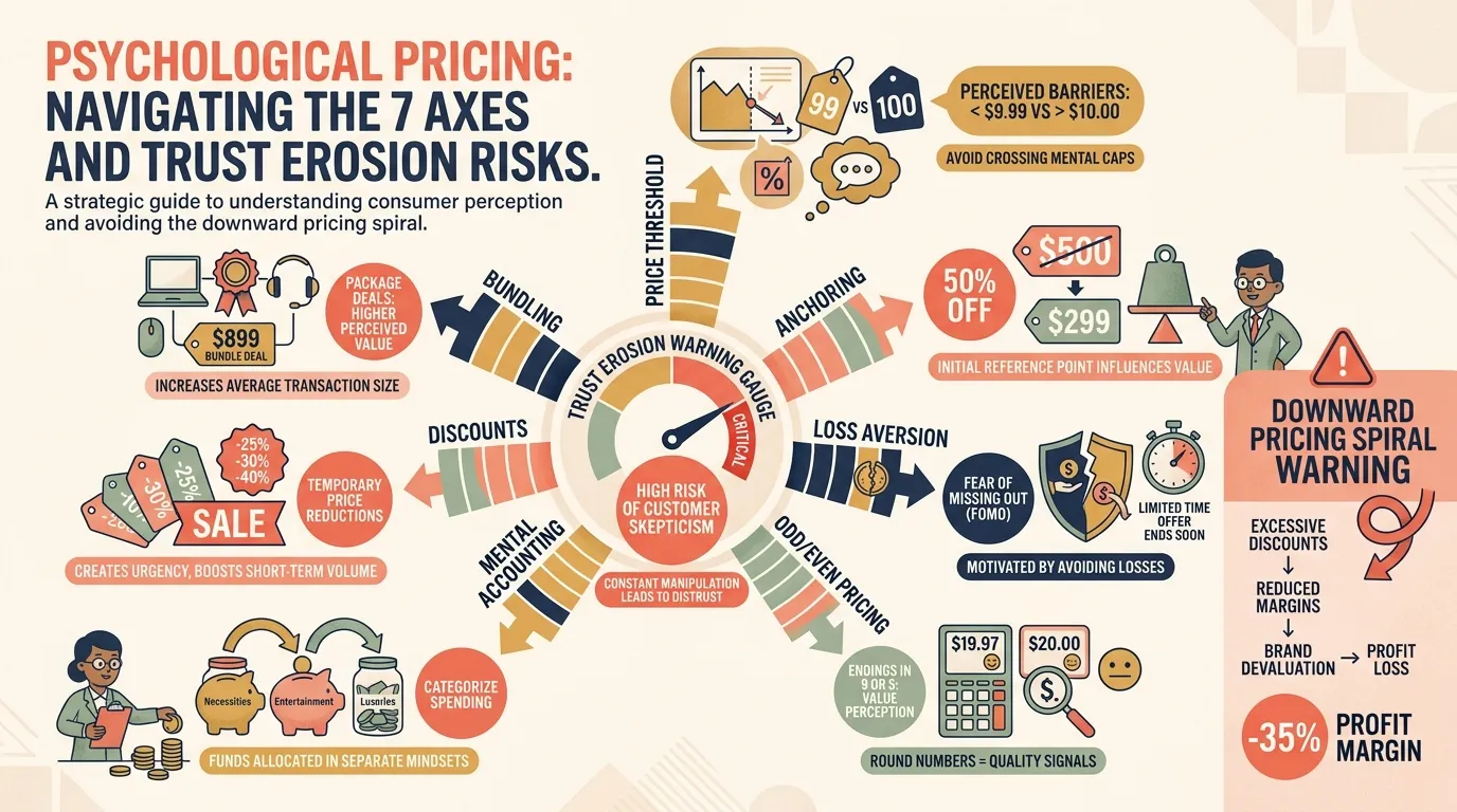
10 Psychological Pricing Techniques: How Reference Points Shape Purchase Decisions